
Pathfinder Labs.
Pathfinder Labs in a veteran resource company located in the Greater New York area. Their site uses A.I. technology to analyze their users in order to match them with suitable resources.
Team
Ivy Chen, Claire He
Project Mission
Redesign site with the addition of an onboarding process in order to increase user sign-ups and engagement.


Meet Stephen Miller
Male - 38 years old - Navy Veteran - New York
After serving the Naval branch for 10 years, Stephen is relocating to NYC with his family. He is looking for local veteran resources to do so. He currently relies on friends and colleagues, but the majority are on the same boat of confusion.
“When you first get out, it is a terrible time, because you’re just not sure what to do next.”
Needs
Actionable assistance
on reintegration
Behaviours
Searches multiple sites trying
to find the right resources
Pain Points
not knowing which organizations to go to
Goals
to find his place in his new community


The User
Stephen's Journey
*Area of Opportunity

Based on our user research we verified that Pathfinder Labs would solve the users' problem finding the right resources.

The Research
In order to make sure our client was on the right track, we conducted research and analysis on the user, the problem space, competitors and heuristics. We then ran a series of tests on the original site in order to find areas of opportunity.
Competitive Analysis
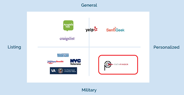
Pathfinder Labs functions as both a resource listing site while also focusing to provide algorithmic personalized recommendations.
There is no other company that serves both functions which makes then valuable in the problem space.


Heuristic Analysis
We conducted a Heuristic Analysis based on the ABBY method of usability.


Navigating Original Site
We did a series of usability tests on the original site.
Signing Up to Site
.png)
Searching for a Resource
.png)
Submitting a Review from Organization Page
.png)
Submiting a Review from Main Page
.png)


Problem
Pathfinder needs to express the value of its site to users in order to generate reviews and engagement.
How might we help Pathfinder Labs attain more
active users?
Hypothesis
We believe that by providing more context, clarity and delight for users, they will see the value of the site, which will entice them to sign-up.
We will know this is to be true when sign-ups increase by 15% .
The Design Studio
We moved onward to our design studio to define the pages to focus our redesign.


We focused our redesign on the following pages:

Revising Navigation
Based off of our research and user tests we began revising the navigation of the site.
Mainly we simplified some titles, removed redundant items such as the double navigation menu on the top nav, and added necessities such as an About section on the top nav.


Mid-Fidelity Prototypes
Based off of our research and user tests we began revising the navigation of the site.
Mainly we simplified some titles, removed redundant items such as the double navigation menu on the top nav, and added necessities such as an About section on the top nav.

The Final Prototype
After testing the mid-fidelity with users we moved on to the final prototype. Our main goals being: clarity and delight.

Originals vs. Redesign
We wanted to make the site more open and inviting so we brightened the color palette as well as added imagery that would incite veteran pride.
Home/Landing (Original)

We also created a "How it Works" section on the main page so the user can understand the purpose of the site easily.
Landing (Redesign)

Added Pages
We wanted to differentiate the main page when the user logs in so we created a variation of it as the "Home Page". The purpose of this page is to cater to the users needs which is to find resources and write reviews. Whereas the landing page is more about getting acquainted with the site.
Home/Logged In (Redesign)

We also created a separate "How it Works" page for the user to refer to the information when logged in.
How It Works (Redesign)

Coins Page
A major point of confusion on the original site was the coins page. Users were confused as to how the coins concept worked. We revised the page by consolidating and clarifying the copy. We also added clear visuals.
Coins Page (Original)

Coins Page (Redesign)

About Page
The main issue with the about page original was excess and redundant copy. We consolidated the copy in order to convey the same information with simplicity. This makes it easier and more likely for the user to read.
About Page (Original)

About Page (Redesign)

Onboarding Flow
We created an onboarding process to further help understand the concept of the site.
This also helps the A.I. of the site get the information it needs from the user in order to configure personalized resource recommendations.


